The purpose of this assessment is to draw pairs of photos together, that are opposite and form contrasts to one another. This opposition may not be obvious and we have to think in terms of more creative contrasts than more than just obvious light and dark, but soft and hard, diagonal and rounded and so on. Looking at the photo pairs and seeing what we can see beyond the obvious and then drawing up these contrasts, that perhaps we wouldn’t normally see.
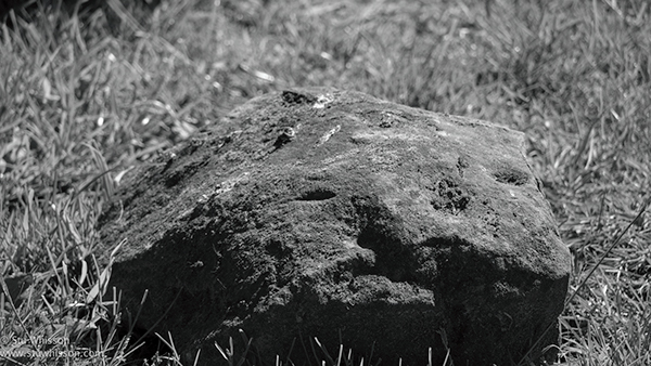
Rock on grass (below) ROUGH.
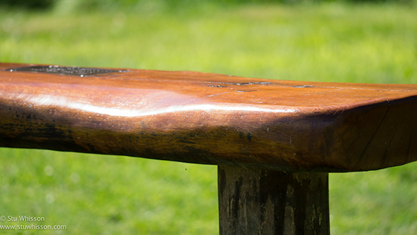
Wooden Bench:
Smooth from years of people sitting and wating for the their school children outside where this bench is placed.
Rough:
Certainly rough in every respect. It hasn’t changed in many years, unlike the bench, which has been been. In fact there are many contrasts that you can draw against these two; ugly / pretty, untouched / fabricated.
Small Yellow Flower (below) DELICATE
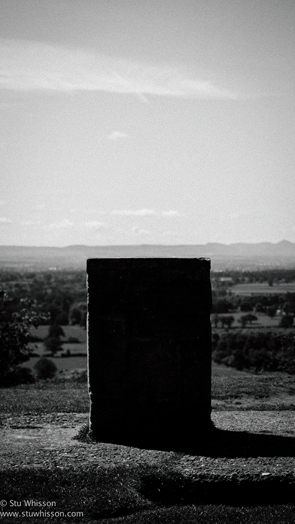
Stone Plyth:
I loved how the shadow being cast by the sun, made this plyth appear more square, strong and almost out of place in it’s surroundings of natural beauty.
ROBUST:
Converting the photo to a B&W, makes this stand out more, making the object, despite not having any detail almost, appear strong and overpowering. It’s almost defiant in this photo, standing out despite of the natural beauty surrounding it everywhere else.
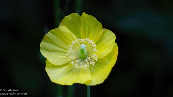
DELICATE:
Everything about this photo is the opposite of the stone plyth. It’s delicate, will only last a few days, maybe weeks at most. It’s almost perfect in its symetry where as the plyth is a chaos of different stones, hard textures that will stand the test of time. This flower is beautiful, but fleeting, delicate, fragile and also perfect.
Contrast Pair:
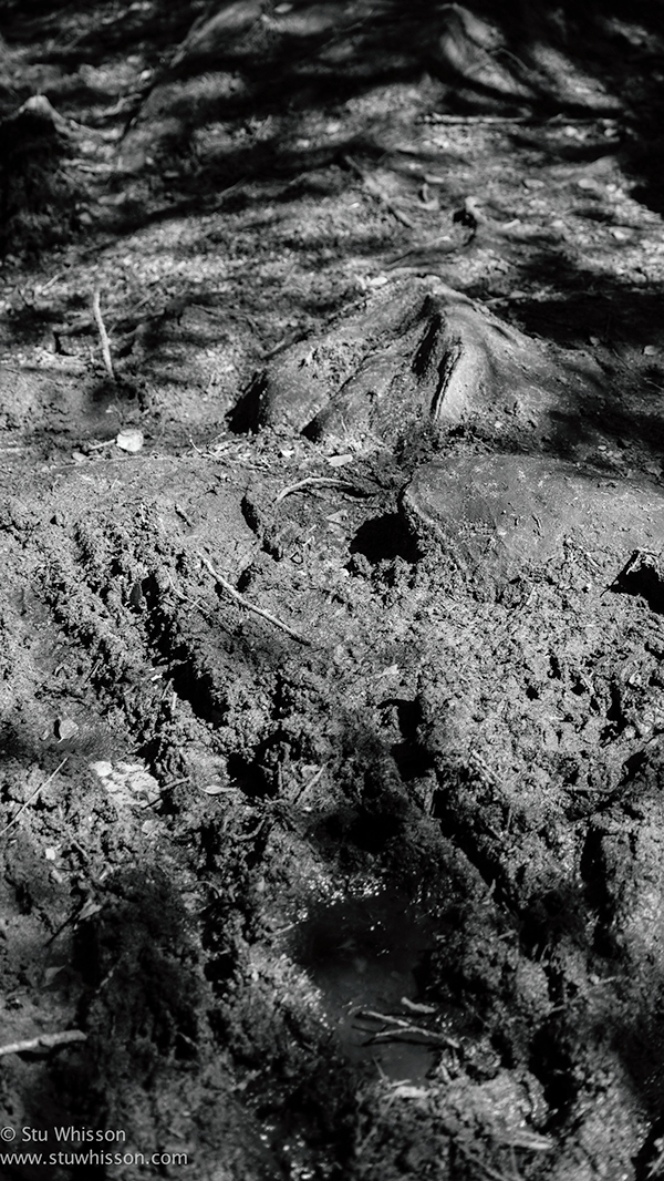
Dirty Path (Bottom) – Dull
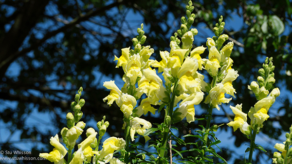
These photos couldn’t be more different. One vibrant and aive, bursting with colour as the flowers reach up on their stems to grab even more of the bright life giving sunlight. Instantly beautiful and mood lifting. There is a sense of health, vibrancy, living colour. Of sunny days and fresh scent. It’s alive and blooming. The contrast below couldn’t be greater. Natually there is little colour and I emphasised it more making it B&W. It’s dirty, dull and what life there is, consists of dead items, the soil is sodden and dirty, you get an immediate sense of wanting to leave it alone, to walk away from it.
Contrasting Pair:
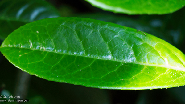
Green Leaf – Bottom – Alive
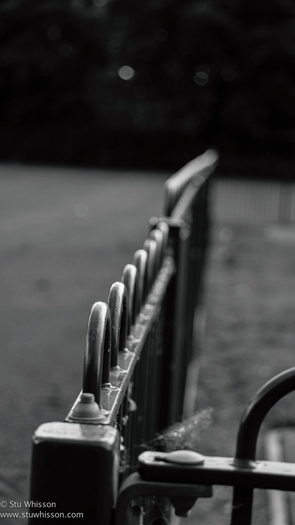
Curves / Bent – Bottom
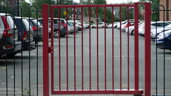
I thought these two were interesting, because they are the same essentially, fencing, gates, stopping access to a playground or car park. However, from taking the photos from different angles and of different parts of the fencing, we get a different feeling. The straight, strong lines of the top image, flat, straight, orderly. Contrasts completely with the almost smooth, flowing of the curves of the top and way the fence adds depth in the image.
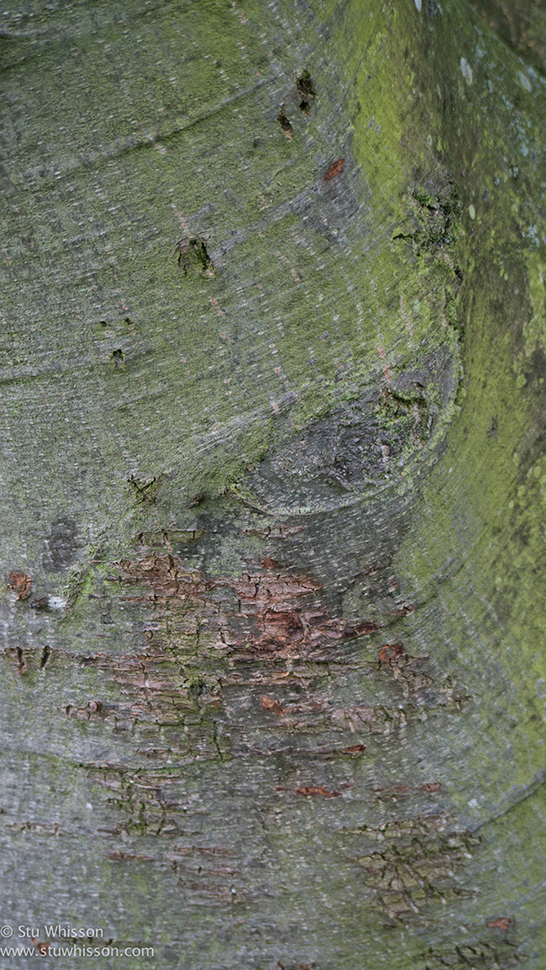
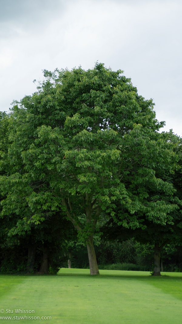
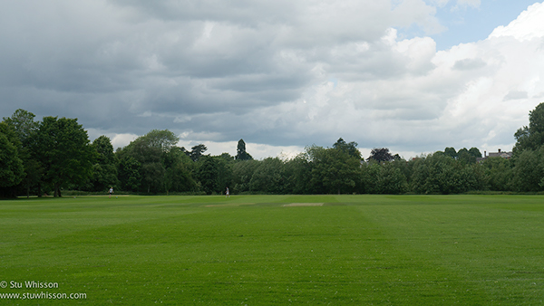
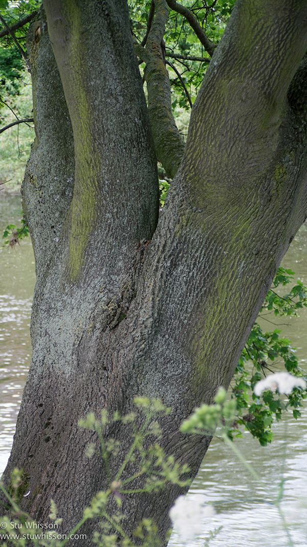
Same Tree in distance – Far
This one is obvious, there is not much to read. However it is interesting, to me at least, that it’s the same tree. Here we see the detail of the bark, the scaring of a missing branch, the minutea of the tree through it’s years. Then in the more open distant view of the tree, we see it as a whole, rather than in detail. We ignore the imperfections and see it for what it is.
Contrasting Pair:
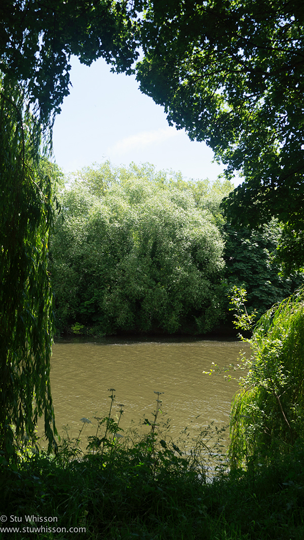
River & Trees – Framed
These two photos were taken at the same location, on a cricket field in Shrewsbury, Shropshire. At the back of which runs the River Severn. By facing in one direction, we have no frame, just the open cricket field and the trees in the background. It feels empty somewhat. Where as the River & Trees photo, from simply turning around from the same location and spot, we get a different feel and a totally different photo. A framed river scene, flowing, natural and framed with these lovely trees.
Tree Trunks (Bottom) – Natural
I thought these two were interesting as they are essentially the same thing. One is made from the other, but still retains most of what makes the wood beautiful. The Contrast being that one is manufactured from the other, into something very different, but still, comparing the two photos, as they both lean in a similar fashion, there is a strange symmetry there too.
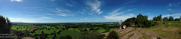
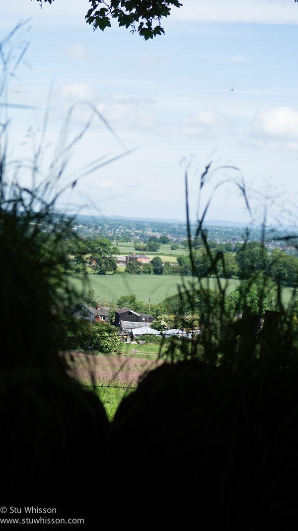
Closed Limited Landscape View – Limited, blinkered
These two photos are quite different and contrast well I think, also in terms of the type of photos they are too, in terms of format. The top image is a panoramic image, showing the expanse of the the Shropshire plains, but below, on the same day, on the other side of the hill, we have a closed view, limited by the wall, as we peek out and try and take in the view again. One is open and spacious, free and full of light. The other feels closed and blinkered, with the hope of more if only we could see past the blinkered view created by the wall.